The first thing that you want to do with regards to color management inside of Photoshop is go ahead and configure color settings which is located under the “Edit” menu.
Now, if you’ve never played around with Photoshop color settings before they may look quite daunting at first, however there are only a few things that you need to know in order to get started.
Working Spaces
On the right-hand side of your interface window, click on the more options button to reveal all of the available options with regards to the color settings.
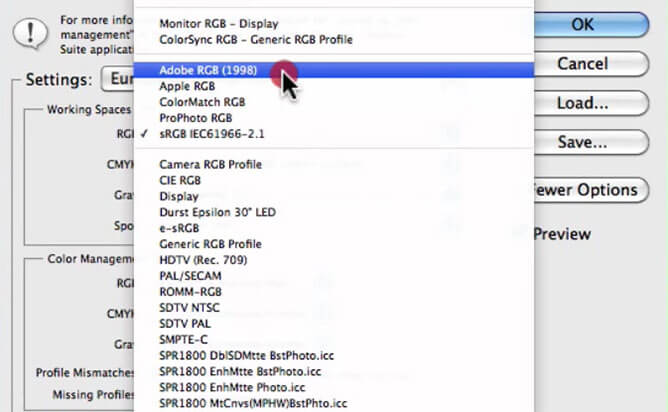
Now if we work our way down from the top, the first option you’ll see is the settings drop-down menu, which has several presets from which you can choose.
Essentially, we’re going to set up custom configuration, so you don’t need to touch any of these settings at this moment.
Underneath is working spaces where you can specify a default color profile for each color mode. We have RGB, CMYK, Grayscale, and Spot. Now a working scale as such, is usually considered as a color profile that you use when editing and adjusting your images.
It’s not device specific, but it has a large enough color gamut that it can contain all of the colors that are present in your digital image.
The most common working spaces that you’ve probably already heard of: are sRGB, Adobe RGB, and Pro photo RGB. I’m going to leave this set to Adobe RGB.
Color Management Policies
Once you’ve chosen your preferred working spaces we can then proceed to configure Photoshop’s color management policies which determine how Photoshop handles color profiles when opening and working with images.
Once again you have the color modes you’ll have RGB, CMYK, and Grayscale. Essentially for these three drop downs you’ll select whether you want to turn them off, whether you want to preserve existing profiles which are embedded profiles that are existed and embedded in a digital file, or whether you want to convert your working RGB space.
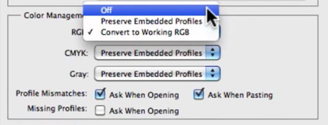
Essentially, whatever you put up here in the RGB space will be what your image is converted if you choose to convert to working RGB space, if your image is actually in a different color profile to begin with.
Underneath these particular color modes we have a couple of check boxes, and they’re primarily for profile mismatches, so when you open up your documents it’ll ask you whether you want to use the embedded profile, or convert to your existing default working space, and you also have missing profiles.
If you open and a mage and it doesn’t already have an embedded color profile, it will ask you what you want to do, whether you want to leave it without a profile, or if you would like to convert to once again a default working space.
Conversion Options
Underneath policies we have conversion options, which as the name suggests is how Photoshop color settings is going to manage the conversion process between the color profiles.
You want to leave the actual engine set to Adobe ACE, but you’ll most likely need to adjust the rendering intent.
Four options which you can choose from include:
- Perceptual
- Saturation
- Relative Colorimetric
- Absolute Colorimetric
I recommend that you use the perceptual, or relative color metric for photographs, and if you’d like to learn more about how rendering intents work then after this tutorial go ahead and watch the next video, on assign and convert to profile.
In this video, I give an in-depth explanation of how rendering intents work, and why you should only use perceptual and relative colorimetric when it comes to photography.
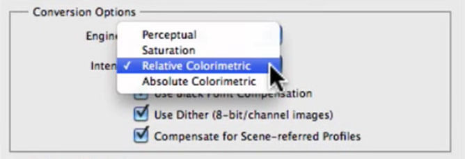
I also recommend that you utilize the use black point compensation, which controls whether to adjust for differences in the black points when converting colors between different color spaces, so I’ll usually leave this set and checked.
Now underneath the Black point compensation, we have use differ. I also recommend that you leave this one checked as it will help with reducing banding artifacts when converting 8-bit images between different color spaces.
Advanced Controls
As for compensate for scene referred profiles don’t worry about this at all, because primarily this option is only available in Photoshop extended and is used for videos.
One of my favorite options inside of color settings that will assist you with calibrating your monitor in desaturate monitor colors which is under the advanced controls.
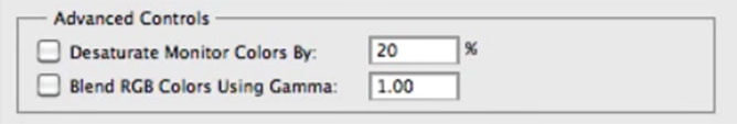
If your photographic or inkjet prints are coming out less saturated than that which you are viewing on your monitor, what you can do is turn on desaturate monitor, and add a specific percentage value that will desaturate your monitor.
You’ll be able to balance the two in order to match them more closely, which will help overall with your color management.
You essentially want to start with about 20% which is your default value here, but if I just turn on and off you’ll notice that it’s desaturated the colors of this particular Granger rainbow image that I have open at the moment.
At this stage I recommend that you also leave blend RGB colors using gamma turned off, as that’s something that we can discuss in the future we get a bit more advanced.
Trouble Shooting
Now if you get stuck and you would like more information on any of the available options within color settings all you need to do is essentially hover over a particular item that you have questions about.
Notice down at the bottom here that you have this description panel, and essentially that’s going to give your technical description of whatever items you hover over, so it’ll give you a little bit more information regarding those if you do have any questions.
Finally, once you’re happy with your Photoshop color settings you can choose to save them by going up to the save button at the top here.
Once you save them as a new preset, they’ll appear in the settings drop-down menu as whatever name you save them under.


Share This Post With Your Friends...
Share the post "How To Configure Photoshop Color Settings"